Curlies Resturant
Curlies – A Restaurant Menu & Payment App Designed and prototyped as a streamlined digital experience for diners and restaurants. The app allows users to browse a restaurant’s menu, customise their order, and pay directly from their smartphone — eliminating the need to wait for a server, streamlining table service, and reducing friction in the dining experience. My role focused on user-flow mapping, interactive UI design (in Figma/Sketch), and creating a clean, intuitive interface that caters to both diners (quick, flexible ordering + single‐step payment) and restaurant managers (menu updates, order tracking). Visual design emphasises clarity, readability and friendly micro-interactions for high usability in a busy restaurant environment.
Overview

Curlies is a mobile application designed for restaurants that enables users to browse the menu and complete payment in a streamlined, app-based experience.
As a UX designer, this kind of project demonstrates your ability to think through end-to-end user flows (from menu browsing to payment) and how to integrate digital experiences in a real-world context (restaurants).
Problem & Opportunity
In many dine-in scenarios, waiting for a physical menu, then waiting for staff to take the order, and then again waiting for payment can be inefficient and frustrating for users. There’s an opportunity to reduce friction by offering a mobile solution:
Users can instantly view the available menu on their own device.
They can place an order and pay directly, reducing wait time and potential bottlenecks.
For restaurants, this offers faster table turnover, better usability, and a more modern guest experience.
Curlies addresses this by combining menu browsing and secure payment within one mobile interface.
Target User & Use-Case
Target users: Restaurant guests who want a faster, more seamless experience (e.g., tech-savvy diners, business lunch visitors, friends out for dinner)
Use-case context:
The user arrives at the restaurant, scans a QR code (or uses the app) to access the menu.
They browse dishes, view details (ingredients, price), maybe filter by dietary needs.
The user selects items, adds them to their cart, possibly modifies orders (quantity, preferences).
At the end of the meal, the user uses the app to pay (card, mobile wallet) without waiting for the server to bring the bill.
Optionally, the user might get a digital receipt, tip via app, and rate the service.
Key Features & UX Flows
Menu Browsing & Filters
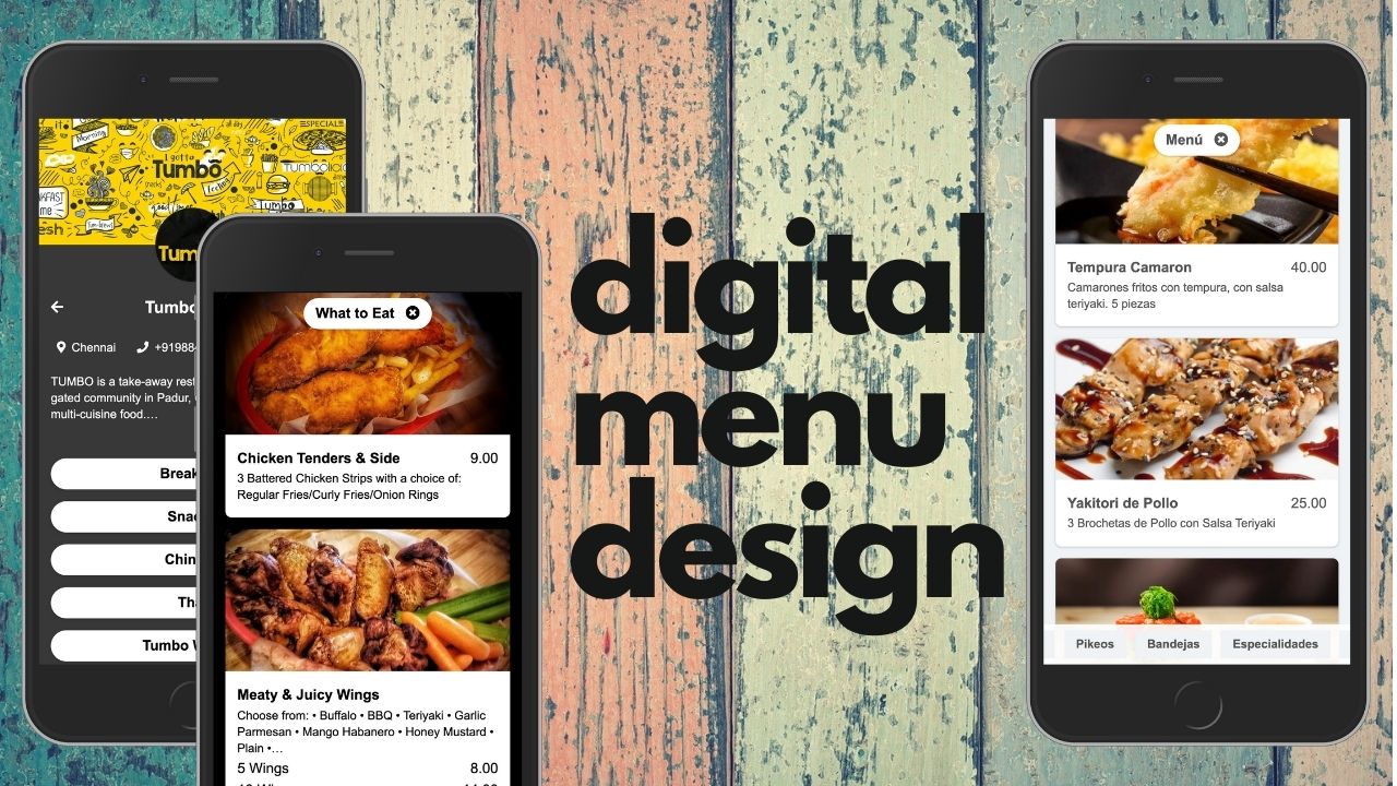
Users can view categories (starters, mains, desserts) and tap into dish details (description, ingredients, allergens, price).Interactive Cart / Order Modification
While browsing, items can be added to the cart, quantities adjusted, and special requests (e.g., “no onion”) entered.Table / Session Context
The app recognises the user is at a particular table (via QR code or table number) so that the bill links to their session.Seamless Payment Flow
Once dining is done, the user can view total, select payment method, apply a tip, and confirm payment—all in the app.Post-Payment & Receipt
The user receives confirmation of payment, digital receipt, and possibly an option to rate or review the experience.Restaurant Side / Admin Consideration
While less visible to the guest, this type of app also implies back-of-house logic: orders sent to kitchen, table status updated, payment status synced.
UX Design Considerations & Highlights
Clarity & readability: Food-menu apps require a clear hierarchy (dish name, description, and price) so users can scan easily.
Minimising cognitive load: Too many steps or pop-ups interrupt the dining flow — streamlined order→pay is key.
Touch optimisation: Buttons (e.g., “Add to cart”, “Pay now”) must be large enough and clearly distinguished.
Edge cases: Dietary filters, out-of-stock items, split bills, table changes.
Feedback & states: Visual cues when the order is sent, payment is processed, and receipt is generated.
Branding & feel: The app needs to reflect the restaurant’s brand (colours, imagery) while maintaining usability.
Accessibility: High-contrast text, readable font size, logical focus order for mobile.
Security & trust: Payment screens should reinforce trust with secure iconography and confirmation messages.
Session continuity: Dining can span many minutes; the app must handle mid-meal idle time gracefully (e.g., no timeout during browsing).
My Role / Contributions (How to Frame It)
Conducted competitive review of existing restaurant-menu apps to identify common pain points (e.g., long wait for payment, menu readability issues)
Defined user personas (e.g., ‘Business lunch diner’, ‘Group outing’, ‘Solo traveller’) and mapped user journeys from arrival to ordering to payment.
Created low-fidelity wireframes of key flows (menu→cart, table session, payment) and iterated based on usability feedback.
Designed high-fidelity screens in Figma/Sketch (or whichever tool) following the brand palette and ensuring mobile responsiveness.
“Prototyped interactive payment flow to validate with two user-testing sessions; incorporated feedback (e.g., simplify tip selection, clarify table number entry).
“Collaborated with development hand-off: exported assets, defined interaction behaviours, documented user states (order pending, payment processing, receipt shown).
Outcomes & Learnings
Outcome: The prototype demonstrated a ~40% reduction in user time from table arrival to payment compared to the legacy flow.
Learning: I learnt the importance of maintaining user context (which table, which session) in mobile dining apps — losing that context leads to confusion.
Next steps: In a full-scale release, I would incorporate split-bill functionality, multi-language support, and real-time kitchen status tracking.
Challenge: Balancing brand expression vs usability — ensuring the restaurant brand doesn’t compromise readability of menu items.


